Preparation:
There are no changes to make to the XHTML of the web page you have been working with. Also, this assignment retains most of the features of the previous assignments, so you should continue using the same stylesheet.
-
Clean up your stylesheet.
As mentioned in class, stylesheets that evolve over time the way the one for these assignment have become quite difficult to maintain. Take the time now to edit your stylesheet:
-
Sort the rules alphabetically by tag name. If a selector uses descendant or child operators (space or
> symbols between tag names, order by the last tag name in the selector. (Think about why
this makes more sense than ordering by the first tag name.)
If a selector uses the comma operator (like html, body, use your best judgment how to alphabetize.
- List class (.) selectors next, in alphabetical order.
- List id (#) selectors last, again in alphabetical order.
- Merge overlapping rules; eliminate contradictions. Look for contradictory settings for the same elements, and eliminate the ones that do not belong.
-
Check your web page to make sure nothing has changed. If anything has changed, it has to be because you the order of the rules; sometimes there is no way around this, and you have to break the alphabetical rule.
On Specificity
Note that the order above (tag names, classes, ids) lists the three types of selectors in order of increasing specificity. A selector like p selects all paragraphs; p.special selects only those paragraphs that have the special class, and p#unique selects only the one paragraph that has the unique id. (Of course, there might not be a paragraph with the unique id, and/or there might be any paragraphs with the special class. In fact there might not be any paragraphs at all! But the principle remains: ids are more specific than classes, and classes are more specific than plain element names.
The rules for specificity are formally presented at the W3C website. Here is a summary:
- Set three variables named a, b, and c to zero.
- Add 1 to a if the selector has a # in it.
- Add 1 to b for each . and each [ in the selector. (We haven’t used [ in any selectors; their use is an “advanced” topic.)
- Add 1 to c for each tag name and : in the selector.
- Disregard spaces, plus signs, and greater-than symbols in the selector.
- If there are commas in the selector part of a rule, they separate individual selectors, and the specificity of each one is calculated separately using the above rules.
- Write the values of a, b, and c in left-to-right order as if they were a single number. For example, the selector p>span:hover (select span elements that are children of paragraphs, but only when the mouse hovers over them), would have the value 003: no id, no periods, 2 tag names, and 1 colon.
- The bigger the number, the greater the specificity. If two rules select the same element, the rule with the higher specificity wins. If two rules select the same element and both rules have the same specificity, the second one wins.
-
Sort the rules alphabetically by tag name. If a selector uses descendant or child operators (space or
> symbols between tag names, order by the last tag name in the selector. (Think about why
this makes more sense than ordering by the first tag name.)
-
Adjust the position of the ordered list; hide the sublists; move the contents.
In the previous assignment, you floated the ordered list to the right. Now give it a fixed position on the left side, under the h1 element. That is, take out the float property, and replace it with position:fixed. Add top and left properties to position the list properly.
We are going to be using this list as a navigation list in the next assignment. The sub and sub-sub lists may be useful at some point, but for now make them disappear:
div>ol>li>ol * { display:none; }We have talked about the inline and block display properties before; now you know another important one! (Could you use a different selector that would target the same elements?)
Make the left margin of the div with the content id 20% of the width of its containing element (the body element) and make the width of the ordered list 20% of its containing element (also the body element).
View your page and check the layout. Do not worry about details, but the list should be on the left, and should not overlap either the heading (above it) or the content (to the right of it).
-
Add a faux column to the html and body elements.
The French word, faux (pronounced “foe”) means “false.” For this step you are to create a colored element that looks like the background of the lefthand 20% of the web page, but without creating an XHTML element that actually occupies that part of the screen. The list on the left side is 20% of the width of the screen, but its height is only enough to hold the list items that make up its content. Our false column will extend the entire height of the screen.
This is an exercise in understanding how background positioning works: If you specify a background position in pixels or ems, the value will specify where to position the top left corner of the background image within the element. But if you specify the position in percentages, that will specify how to line up the corresponding positions of the screen and the image, a totally different matter.
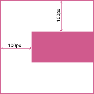
For example, here is a 200×100 rectangle inside an element that is 300 pixels wide, with background-position:100px 100px;. The top left corner of the rectangle is 100 pixels in from the left and 100 pixels down from the top:

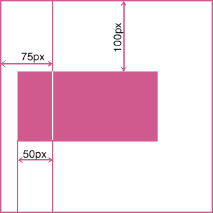
But here is the same 200×100 rectangle inside the same 300-pixel wide element, but with background-position:25% 100px;:

The top is positioned the same (because the same value was used), but now you have to do some arithmetic to figure out where the rectangle is positioned horizontally. 25% of 300 is 75, the number of pixels in from the left of the containing element, and 25% of 200 is 50, the number of pixels in from the left of the rectangle. As the diagram shows, a vertical (red) line 75 pixels in from the left edge of the container lines up a vertical (white) line drawn 50 pixels in from the left edge of the rectangle.
That is, specifying background-position:25% 100px; made the position 25% of the way from the left edge of the image file line up with the position 25% of the way from the left edge of containing element. If the “containing element” is the body or html element of the web page, the leftmost 25% of the browser window will be covered by the leftmost 25% of the image file: our “faux column”̈ effect. But you have to be sure the image file is wide enough that the leftmost 25% of the image will cover the leftmost 25% of the viewport no matter how wide the user tries to make the browser window. And the faux column for this assignment will be 20%, not 25% wide.
The faux column is to provide a color fill for the left hand 20% of the browser window, and to have no effect (be transparent) over the remaining 80% of the viewport (the proper name for the part of the browser window where the web page is displayed. Regardless of how wide the viewport is, we want the leftmost 20% to have the faux column color. The solution is to decide how wide a browser window will “ever” be, and to make the background image width wider than that. Let’s say the largest monitors these days are 2000 pixels wide, and make our background image 5 times wider than that: 10,000 pixels. The height of the image doesn’t matter because it will be tiled vertically. Create a Photoshop document 10,000 pixels wide, but as few pixels tall as you are comfortable working with: 50 should be enough, for example. Be sure the background of the image is transparent, or you will have to erase all the pixels in the bottom layer.
The goal is to draw a solid colored rectangle that fills exactly the leftmost 20% of the image (2000 pixels).
From the View menu, turn on the Snap To > Guides option (if it is not already selected). Drag a guideline out from the left ruler as demonstrated in class and get it to line up with the 2000 pixel ruler point. (If rulers are not showing, type Ctrl-R. If the rulers are showing, but the units are in inches instead of pixels, right-click on the ruler and select pixels from the drop-down menu.) Be sure to position the guide exactly at the 2000 pixel mark. Zoom in (Ctrl-+) on the top ruler so you can see the tick marks clearly, and drag the guide into the exact position. (The move tool has to be selected to do this; typing ‘V’ will turn it on.) You can zoom back out to normal view by typing Ctrl-0.
Select the color you want for your column by setting the foreground color (click on the foreground/background tool), then select the rectangle tool, be sure the “fill pixels” option is selected at the top of the window. Drag out a rectangle starting outside and above the image on the left, over and down to cover the image vertically; line up the right end of the rectangle with the guideline at the 2000 pixel point; it will snap into place.
Save the PhotoShop file (the .psd file) in your images directory, and then save a suitable background image in the same directory. It will probably be a PNG-8 file, as discussed in class. Use this file as the background image for the html and body elements of your web page.
Be sure the web page has your colored faux column on the left side, lined up with the width of the list that you have fixed in position on the left side, no matter how wide or narrow you make the browser window.