At this point, you should have a single web page that includes a heading and several paragraphs, with a triply-nested set of lists between the first and second paragraphs. There should be a div surrounding all the paragraphs (and the lists between the first and second paragraph). If you have not completed Assignment 4 successfully yet, you need to do so before doing this assignment.
-
Float the set of ordered list to the right.
Without adding any class or id attributes to your web page’s markup, add code to the stylesheet you have been working with to float the outermost ordered list to the right. Hint: because you have a div around all the paragraphs, the outermost ordered list is the only ol that is a child of a div.)

Add a background color to the outermost ordered list so it is visually separated from the remainder of the page.
Make sure there is some space between the outermost ordered list and the text in the paragraphs that follow it, which should now be flowing around the left side of the lists.
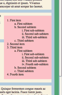
In this screenshot, which shows part of the right side of the browser window, the green patch is part of the background of the body element, the light blue parts are the background of the div that contains both the paragraphs and the ordered lists, and the cream color is the background of the paragraphs.
Note that only the outermost list (1, 2, 3, …) has been floated to the right. The lower-level lists are still aligned to the left side of their containing elements.
When you set this up, you will see that the numbers for the top-level list appear at least partly outside the area covered by the background color for the list. To get that list’s numbers inside the background, as in the screenshot, you will either have to apply negative left padding for that list, or simply to use the list‑style‑position property with the value inside. You may use either technique, but be sure to try both for practice.
-
Add a stock photograph “comp” to your web page
First read the Wikipedia article on microstock photography, then go to iStockphoto.com and sign up for a free account there.
Select an image from iStockphoto suitable to use as “visual content” for your web page. That is, pick a picture of something that you might write about in the surrounding text—if only you weren’t writing in fake Latin! There is no hard and fast rule here. A picture of clouds could be used as a decorative element on one web site, but the same image might be an important illustration in a meteorology site. Feel free to be creative, and feel free to choose either a landscape (horizontal) or portrait (vertical) image.
Download a free “comp” of your image, and put it in the images directory of your web site.
Your image file for this assignment must have the iStockphoto watermark: it’s how I will know that you did this step of the assignment correctly.
Add an img element to your website between the third and fourth paragraphs. Use a CSS rule to float the image to the left. View the page to make sure your picture has been linked to properly and is displayed in the correct position. Do not add any margins, borders, or padding to it yet.
-
Use Photoshop to optimize the comp for the web.
For this last step, you are to open your picture in Photoshop, and use the “Save for Web and Devices” option (it’s under the menu) to explore alternative ways to reduce the size of the file while maintaining full image quality. This process was demonstrated in class on April 8.
In the Save for Web and Devices panel, note the size of the original file you downloaded from iStockphoto.
Reduce the intrinsic size of the image so that it is 200 pixels along its longer edge (its width if it is a horizontal photo; its height if it is a vertical photo). Experiment with various JPEG compression settings, and pick the lowest quality setting that still makes the image look good. Experiment with various PNG settings to see if you can create a smaller file of equal image quality to the JPEG.
Note the size of the optimized file.
Save the file in your site’s images directory using a different file name so you don’t overwrite the file you downloaded from iStockphoto. Change the img element so it links to the new photo.
Verify that the photo is displayed properly, and then make the following changes to the CSS for the image:
-
Use the width or height
property to reduce the dimension of the long side to 150px. If you have not done so already, remove
the width and height
attributes from the img tag so that this CSS manipulation does not cause
any distortion of the image.
Verify that the image displays with no distortion.
- Adjust the margins, border, and padding of the image to make it look “good.”
-
Use the width or height
property to reduce the dimension of the long side to 150px. If you have not done so already, remove
the width and height
attributes from the img tag so that this CSS manipulation does not cause
any distortion of the image.