Introduction
This assignment deals with using CSS to control the layout of web pages. In particular, the assignment is to position the list of navigation links on your blog web page so they sit on top of the “faux column” you created using a background image in Assignment 4.
If you were not able to complete Assignment 4 successfully, set up your Blog index page as follows:
- Download this background image file to your site’s images directory.
-
Set up your blog entries as an Ordered List in your Blog’s index page:
<body> <h1>My Blog</h1> <ol id="blogEntries"> <li> <h2>Title of First Entry</h2> <p class="dateline">October 15, 2008</p> <p>Lorem Ipsum text goes here …</p> <p>More Lorem Ipsum text goes here …</p> <p>Still more Lorem Ipsum text goes here …</p> </li> <li> <h2>Title of Second Entry</h2> <p class="dateline">October 31, 2008</p> <p>Lorem Ipsum text goes here …</p> <p>More Lorem Ipsum text goes here …</p> <p>Still more Lorem Ipsum text goes here …</p> </li> </ol> <!-- links to home page and validators go here --> </body>
-
Set up your blog entries list to use the background image as a “faux column” occupying the left 20% of the box holding the list,
and move the list contents to the right of this column of color. To do this, put this rule in your Blog’s style sheet:
#blogEntries { background: url(../images/2000x20_400_left_fill.png) repeat-y 20%; padding: 0 1em 0 20%; }
- Make sure your Blog page is valid and looks right. I have posted a sample version of Assignment 4 that you may try out for yourself and see what that assignment was supposed to look like.
The Assignment
-
Remove the list item numbers from the blog entries list.
Simply create a rule for the ordered list with the id of blogList (or whatever you called it). Give the list-style-type the value none.
-
Put all the “navigation links” into an unordered list and remove the bullets.
At various points the links (anchor elements) at the bottom of the page might have been inside paragraphs and/or divs. If you have not done so already, take the three links at the bottom of your Blog out of whatever elements (p, div, or anything else) and put each one inside a list item, with the three list items part of an unordered list with an id of navList.
Using the same technique as you did to remove the numbers from the blog entries list, remove the bullets from the navigation list.
-
Position and resize the navigation list so it fits in the faux column.
Make the width of the navigation list 20% of the width of its containing element, the body of the web page; remove all margins and padding, and use absolute positioning to place the list at the left edge of the body and down 6 ems from the top. The 6 ems value should position the list below the h1 at the top of the page, and thus inside the space occupied by the blog entries list.
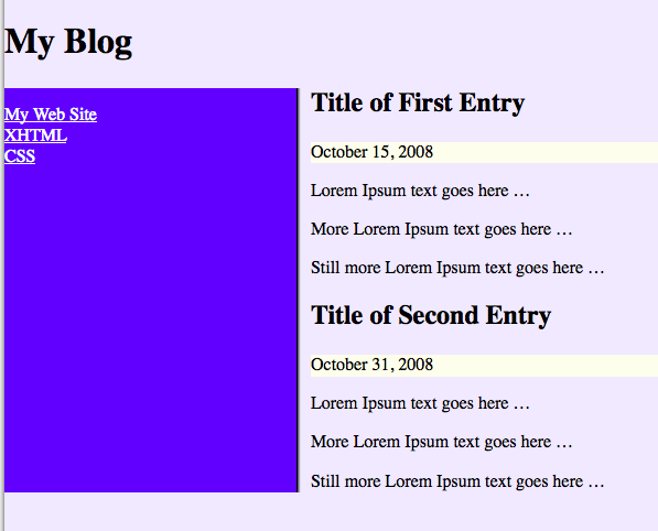
If necessary, change the text color of the links so you can see them. Here is the sample page viewport after making these changes; the color property for a elements inside the navigation list has been set to white. Right-click and select “view image” for a larger version:

-
Style the navigation list items and anchors.
The effect you are to achieve here is to use CSS to make the navigation list’s links look and operate like buttons. To do this, you need to use a trick shown in class: if you set the display property of the anchors to block, the anchor will fill the entire list item, but will not start on a new line the way block elements normally do. I call this a “trick” because there seems to me to be no general principle involved. The behavior is, however, explicitly stated in Section 10.3.3 of the CSS Specification, Block-level, non-replaced elements in normal flow.
To make the anchors/list items act like buttons, you need to provide a distinctive appearance when the user hovers over the button: use the dynamic pseudo-class, a:hover as the selector for elements whose propeties you want to set. To prevent the rule from applying to all anchors on the page, you should limit to the ones inside your navigation list:
#navList a:hover { background-color: red; }
While writing this assignment up I discovered a browser-specific dependency I hadn’t known about. If you specify a background color for the a:hover dynamic pseudo-class without specifying an explicit background color for the corresponding “regular” a elements, Internet Explorer (all versions tested) will not change the background color until the user actually clicks on the anchor. Other browsers do not display this behavior. The W3C used to recommend that you always set both the background-color and the color any time you set one of them to avoid accidently making the text go invisible against the background; following that advice would avoid the IE dependency.
There is another dynamic pseudo-class that can be used to enhance the “button” effect: a:active. This one takes effect when the user actually presses the mouse button on the element. So you can have three different appearances for your buttons: (1) when they are just sitting there, (2) when the user mouses (hovers) over them, and (4) when the user actually is pressing them. Finally, there is a fourth dynamic pseudo-class, a:visited that you can use to give a different appearance to anchors that would take the user to places they have already visited, like the purple text that most browsers use in place of the default blue.
To complete the button effect, you will also need to change the text-decoration property for the anchors; the default value is underline, which you should set to none.
Finally, you will need to adjust margins, padding, and possibly the borders of the list items and/or their contained anchors to achieve the exact appearance you want.
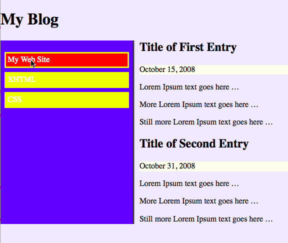
Here is a screen shot of the sample page viewport after making these changes; the mouse is hovering over the first link in the list. Your colors and sizes will undoubtedly be different:

Submit The Assignment
I will check your assignment by copying it from Maple to Babbage; to submit the assignment, send me an email with your name in the message body saying it is ready for me to look at. Send your email to me by midnight on the due date (November 13). My email address is:
Christopher.VickeryATqc.cuny.eduThe Subject Line of your email must say CS-081 Assignment 5, exactly like that, in order to avoid my spam filters.